Bringing clarity to moments that matter
Hi, I’m Chareyon (aka Chari)
I design thoughtful digital experiences that bring clarity and confidence to complex interactions.
Explore my projects
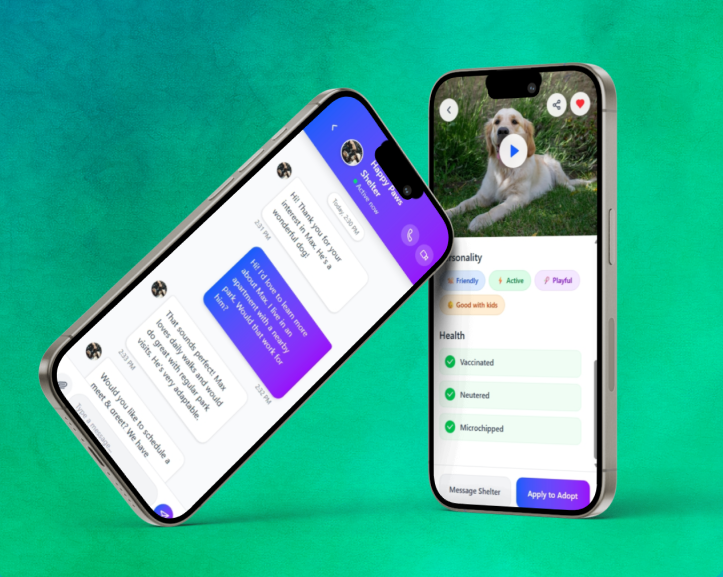
PetConnect
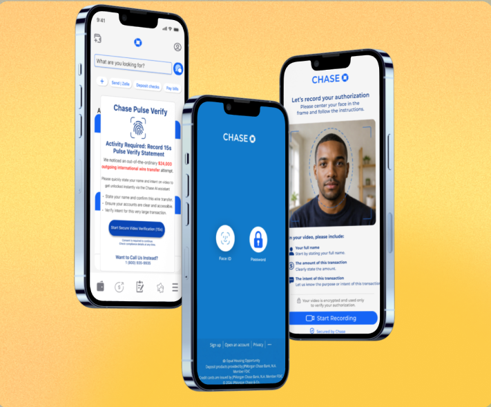
Chase Pulse Verify
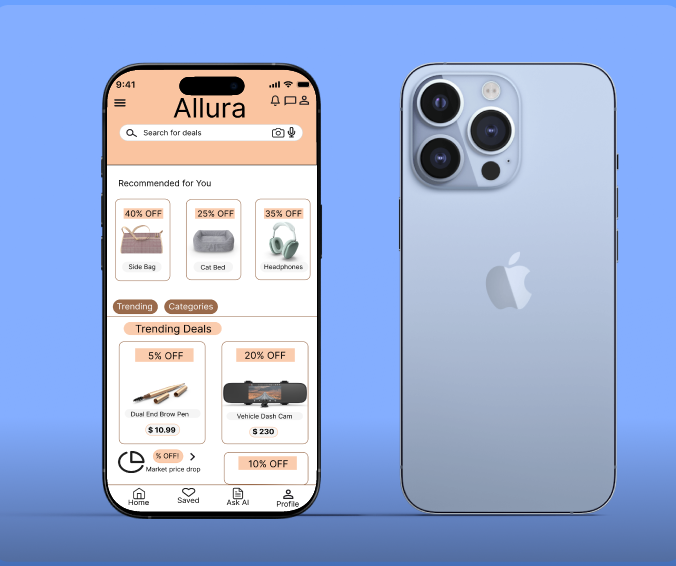
Allura

Suite Home Stays