Allura
The preferred one-stop-shop
Allura is a modern e-commerce app concept focused on seamless product discovery and intuitive shopping. I designed the experience from wireframes to high-fidelity mockups, exploring how clean navigation, thoughtful layouts, and AI assistance can simplify the online shopping journey.
Process: User research, key insight & findings, brainstorming & ideation, sketching initial concepts, wireframing the layout, creating high-fidelity mockups
My Role: UX/UI Designer
Tools Used: Figma & FigJam, Microsoft word
Duration: 4 weeks
The Design Process
The design focuses on a clean, modern aesthetic combined with simple navigation and a visually engaging layout. Throughout the design process, I focused on balancing usability with visual appeal so that users could quickly find products while still enjoying a stylish and immersive shopping experience.
User Personas
Based on insights gathered during user interviews, I developed a user persona to represent common shopper behaviors, motivations, and goals. This persona helped keep design decisions focused on real user needs, such as easily comparing products, finding the best price, and navigating the app without feeling overwhelmed.
User Flows
To better understand how users would interact with the app, I mapped out key user flows. This helped visualize the steps users take from browsing products to completing a purchase, ensuring the navigation felt simple and logical.
Information Architecture
I structured the app’s content and navigation to make browsing products easy and intuitive. Categories, product listings, and recommendation sections were organized to help users quickly find what they are looking for while still encouraging exploration.
Iteration and Refinement
As the design developed, I continuously refined layouts and feature placement to improve clarity and usability. Iterating on wireframes and mockups allowed me to simplify the interface and create a cleaner, more user-friendly experience.
Questions I asked my interviewees
Can you walk me through the last time you used a mobile app to buy something?
When you’re browsing a mobile app, what helps you decide whether to purchase a product or not?
Have you ever abandoned a purchase on a mobile app? If so, what made you stop?
How do you usually find products in a mobile shopping app?
What frustrates you most when using a mobile shopping app?
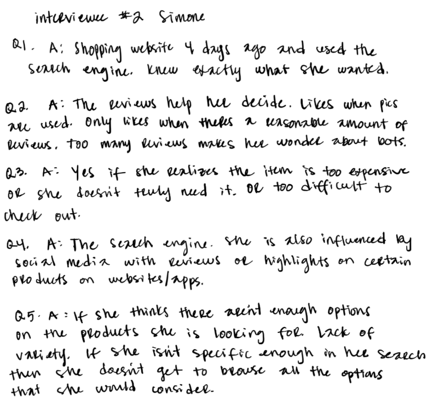
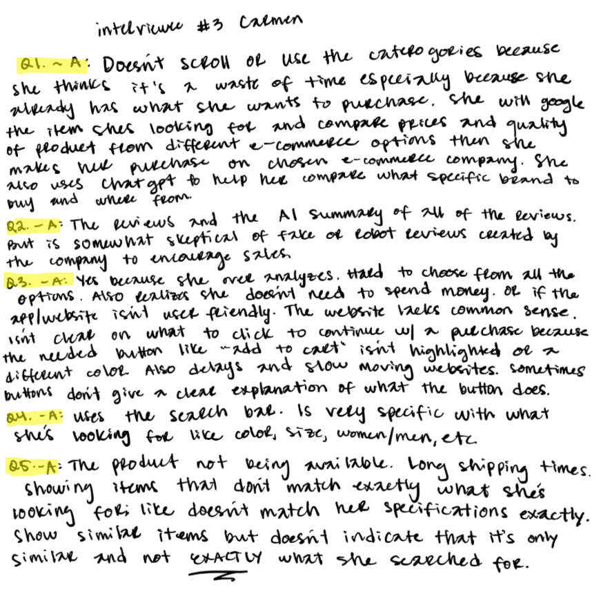
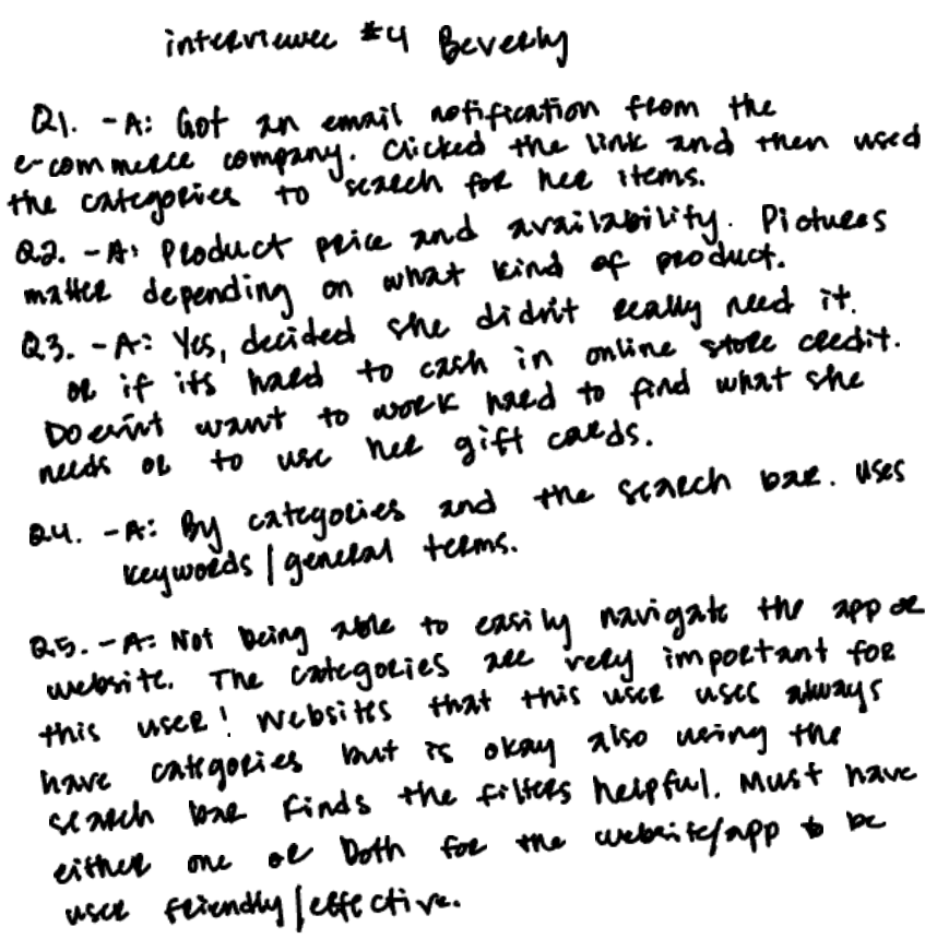
I interviewed several participants who regularly shop online. Each interview focused on their typical shopping behaviors, how they discover products, and what features make them trust or abandon an app.
User Research
Before designing Allura, I conducted short user interviews to better understand how people currently shop online and what frustrations they experience with e-commerce platforms. My goal was to uncover pain points, habits, and expectations that could inform the design of a more intuitive and personalized shopping experience.
Key Insights
Interview insights showed that users want more than a smooth checkout—they want confidence that they’re making the best purchase for the price. Many participants said they often compare options before buying and value clear information that helps them feel they’re getting the best deal. At the same time, users mentioned frustration with overwhelming choices and irrelevant recommendations, highlighting the need for a shopping experience that feels simple, trustworthy, and price aware.
Bringing the Allura Brand
to Life!
Brainstorming + Ideation
Using the insights from my research, I began brainstorming possible features and flows that could improve the shopping experience.
During this stage, I focused on ideas that would:
• simplify product discovery
• provide smarter, more relevant recommendations
• create a clean and modern browsing experience
• help users feel guided rather than overwhelmed
I explored multiple concepts and sketched different approaches for the home screen, product browsing, and recommendation sections.
This phase was intentionally exploratory, allowing me to quickly generate ideas without worrying about visual perfection.
Sketching + Early Concepts
Once I had several potential ideas, I translated them into quick sketches. Sketching allowed me to rapidly experiment with layouts, navigation structures, and feature placement.
These early sketches focused on:
• organizing product categories clearly
• highlighting recommended items
• designing a simple browsing flow
• integrating an AI-assisted recommendation experience
Because sketches are low-fidelity, they made it easy to test and adjust ideas before moving into digital design.
More Raw Interview Notes
Creating the User Persona
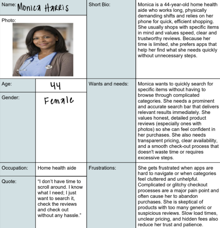
Monica is not only looking for speed and efficiency in her shopping—she’s also focused on finding good deals. She wants to make every purchase count, balancing value with convenience. To design a shopping app that feels intuitive and effective, I created Monica, a 44-year-old home health aide, to represent users who are time-constrained, goal-oriented, and deal-savvy.I created Monica by analyzing common frustrations in mobile shopping apps, such as cluttered navigation, slow searches, and unclear pricing, combined with insights from her lifestyle and priorities. Her persona highlights what drives her shopping decisions: speed, confidence, and value.
Monica guided key design decisions throughout the project. Her profile informed the creation of a prominent, fast search bar, photo-supported, trustworthy reviews, and clear deal indicators to make savings immediately visible. Using her as a reference, I continuously asked: “Would this help Monica find what she needs quickly and at a good deal?”
Centering the design around Monica ensures the app meets the needs of users who want efficient, reliable, and value-focused shopping experiences.
More about my
Brainstorming & Ideation
After identifying key user needs during the research phase, I moved into brainstorming to explore potential solutions that could help users find the best deals while keeping the shopping experience simple and intuitive.
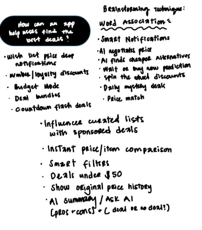
To generate ideas, I used the Word Association Technique, a creative brainstorming method that helps uncover opportunities by connecting related concepts. I began with a central question: How can an app help users find the best deals? From there, I expanded outward, writing down related ideas and features that could support smarter shopping decisions.
This exercise produced a wide range of potential features, including price-drop notifications, loyalty rewards, deal bundles, and countdown flash sales. I also explored more advanced concepts such as AI-powered price negotiation, alternative product suggestions, and price prediction tools that could advise users on whether to buy now or wait for a better deal.
Additional ideas focused on improving product discovery and comparison, such as instant item comparison, price history tracking, smart filters, curated deal lists, and an AI assistant that summarizes whether a product is truly a good deal.
The brainstorming phase allowed me to explore both practical and innovative solutions before narrowing down the most valuable features. These ideas later informed the sketches and wireframes that shaped the core functionality and user flow of the Allura app.
Early ideation using the Word Association Technique to explore potential features for smarter deal discovery.
Sketches
During the ideation stage, I explored multiple concepts through quick hand-drawn sketches to visualize potential features that could help users find better deals while shopping. Sketching allowed me to rapidly translate ideas from brainstorming into tangible interface concepts without committing to high-fidelity design too early in the process.Two concepts emerged from this exploration. The first was an AI-powered shopping assistant designed to guide users through the platform, help them discover products, and recommend deals based on their preferences. The second concept was a “Spin the Wheel” feature, a gamified experience where users could spin a wheel to unlock discounts and promotional offers.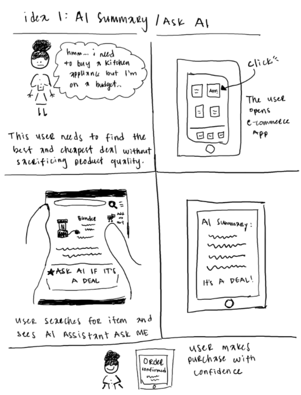
After evaluating both ideas, I chose to move forward with the AI assistant concept. While the spin-the-wheel idea added an element of fun, the AI assistant offered a more practical and scalable solution. It could provide personalized recommendations, help users quickly locate products, and surface relevant deals in a way that improves the overall shopping experience.These early sketches helped clarify the direction of the product and served as the foundation for the wireframes and design iterations that followed.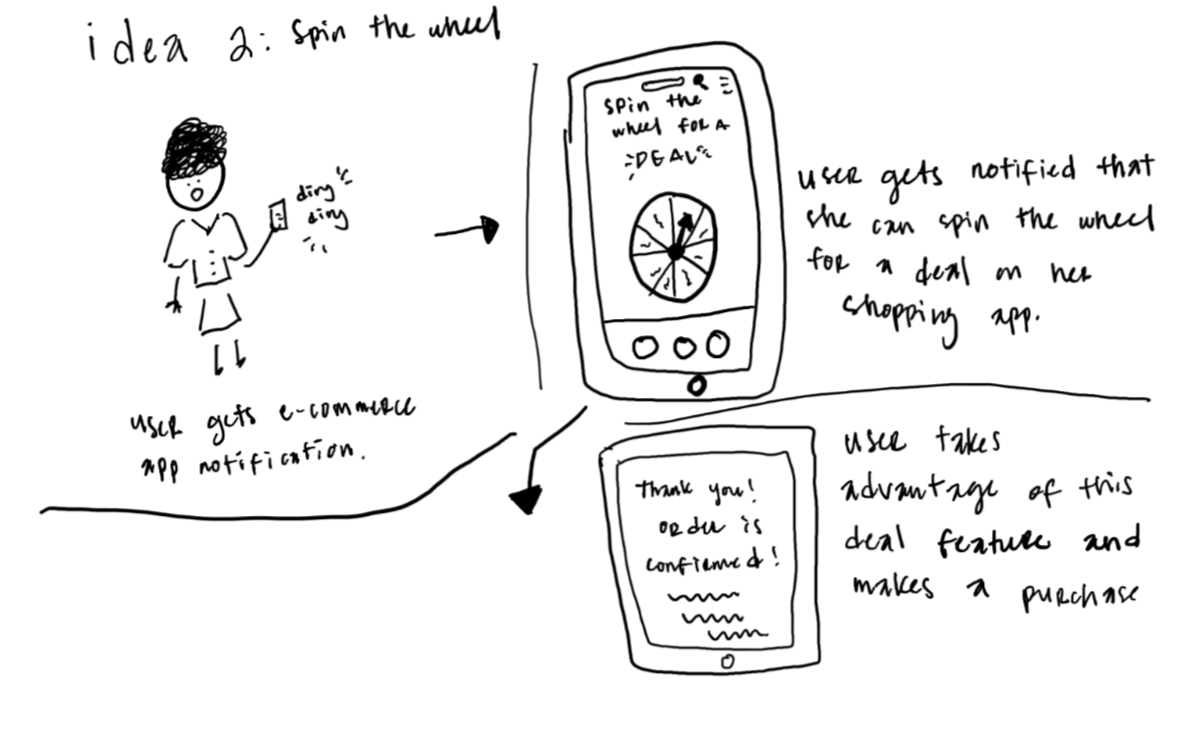
Sitemapping
To organize the AI assistant feature within the Allura app, I created a sitemap to map out the structure and flow of the experience. This allowed me to visualize how users would access the assistant, how conversations could guide them to products or deals, and how the assistant connects to other areas of the app. Developing the sitemap early in the process helped establish clear information architecture and ensured that the feature would integrate smoothly into the overall user journey before moving on to wireframes and higher-fidelity designs.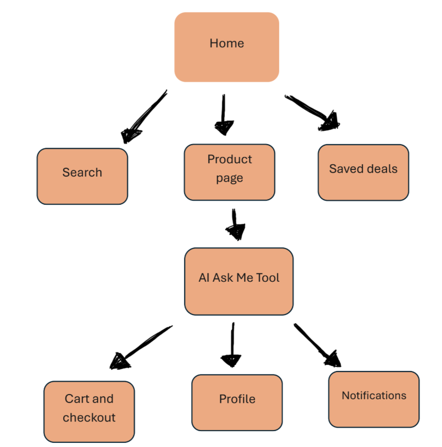
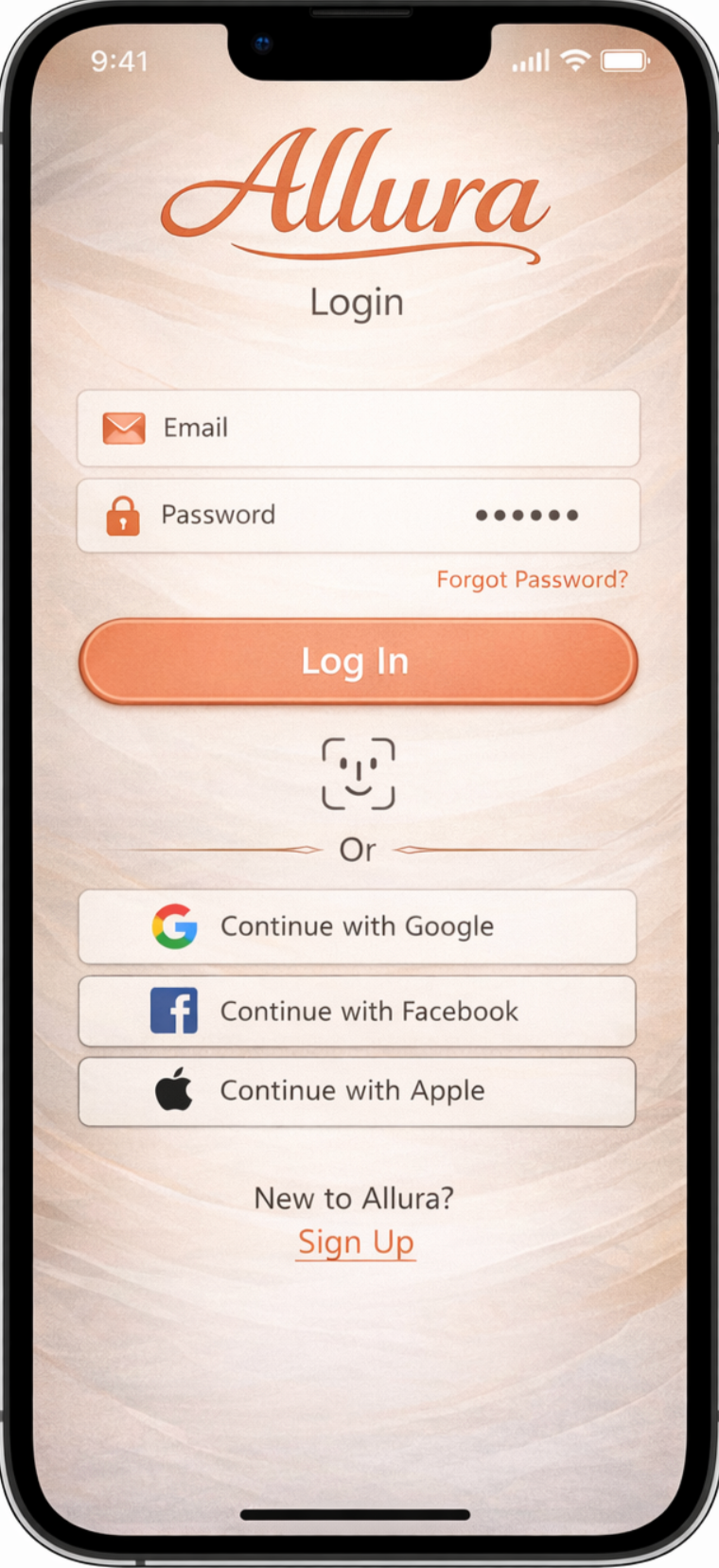
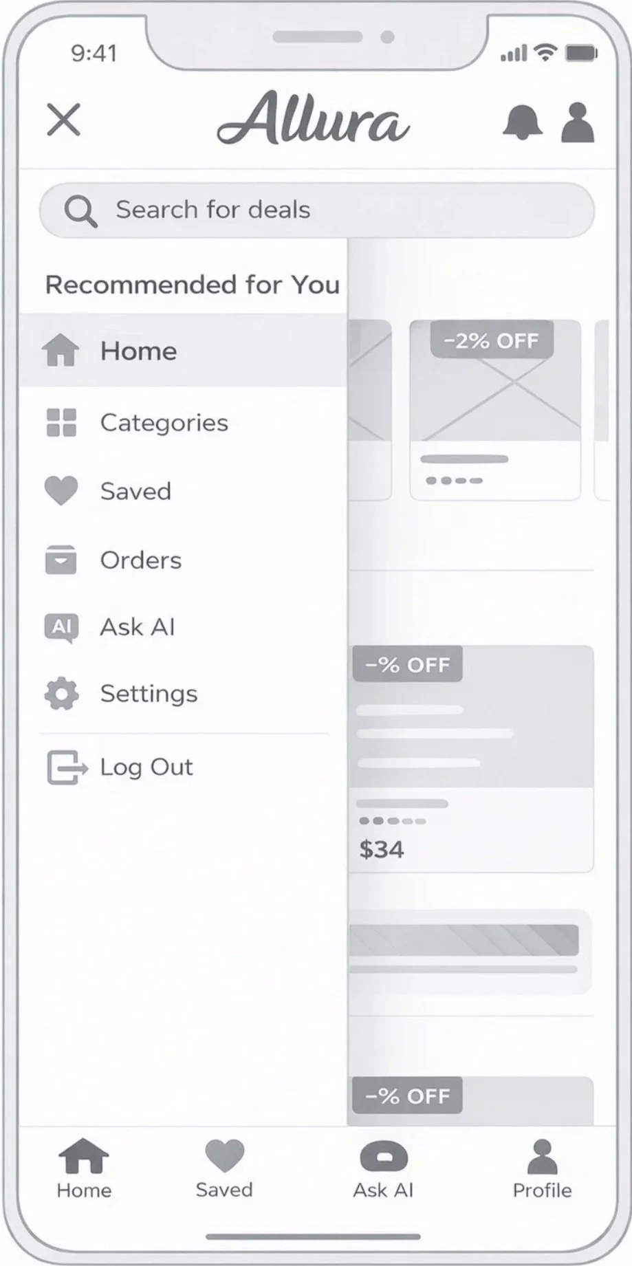
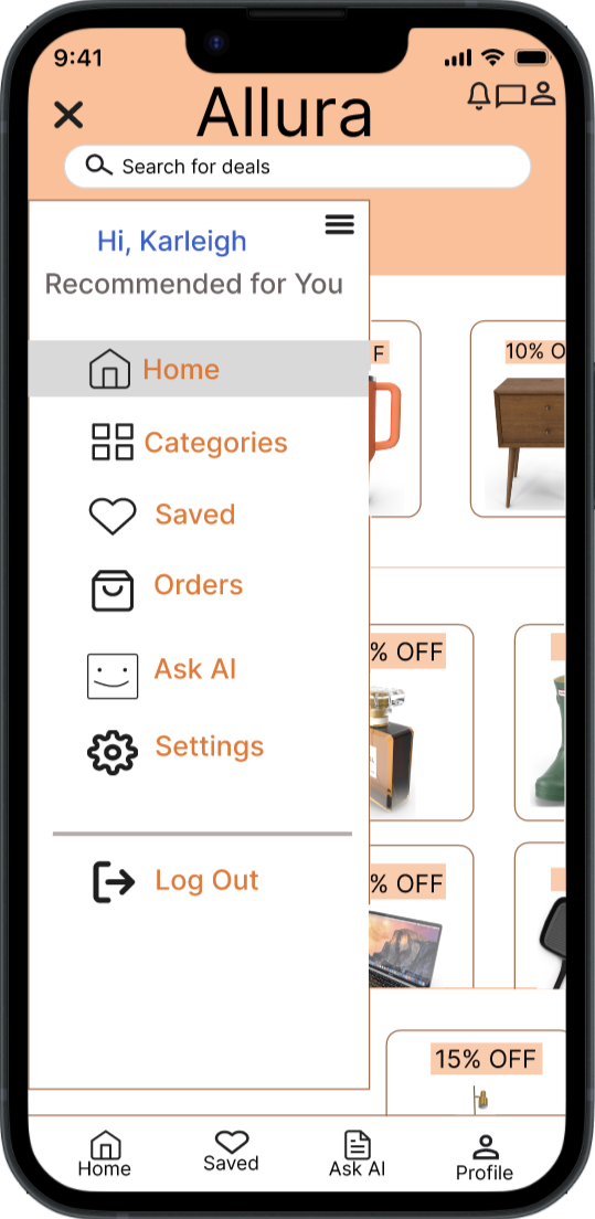
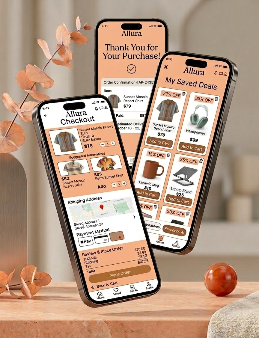
Wireframe & hi-fi mockup #1
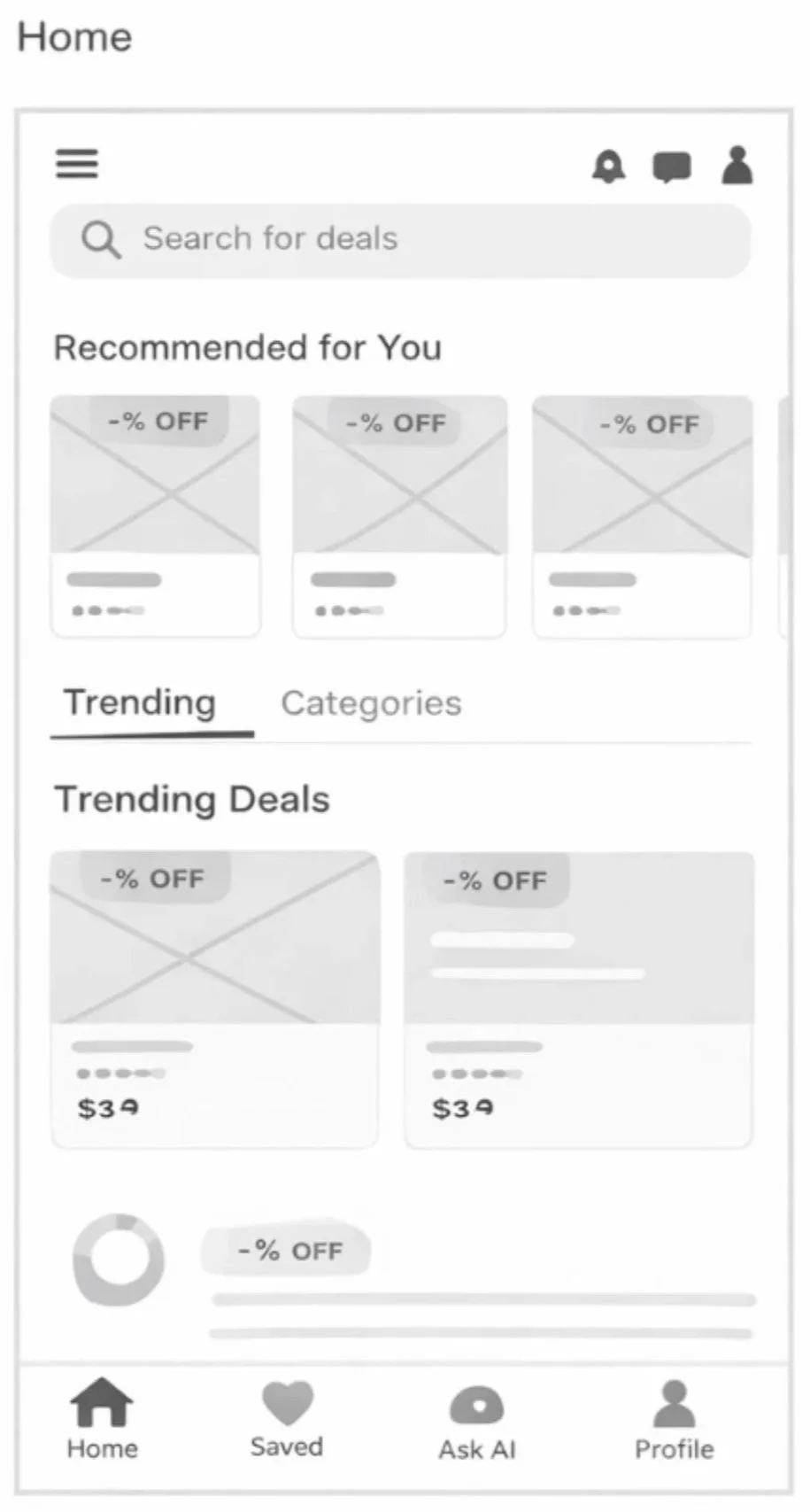
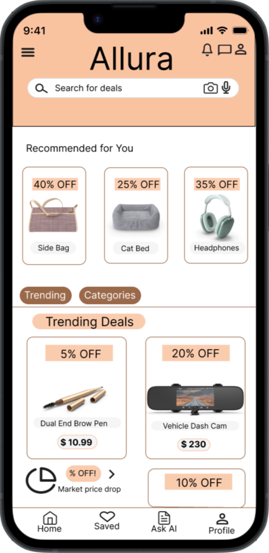
Wireframe & hi-fi mockup #3
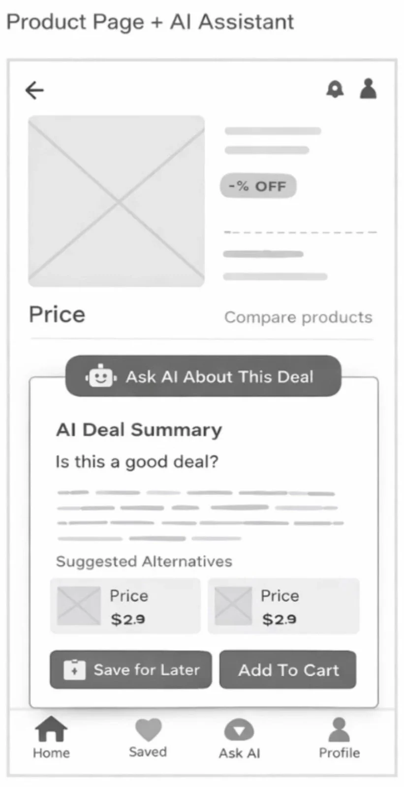
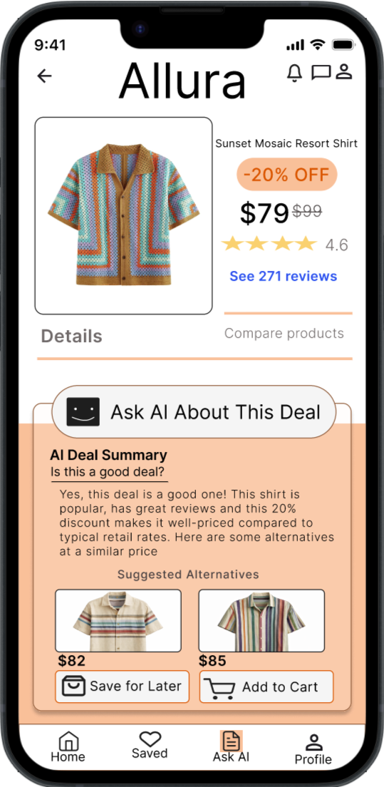
Wireframe & hi-fi mockup #2
Usability Testing
Since Allura is currently a conceptual framework, the next phase of this lifecycle would focus on rigorous validation. To move from high-fidelity prototypes to a market-ready product, I would implement a multi-stage testing environment to bridge the gap between design intent and user reality.
-
Before launching into usability testing, I would establish three main objectives to ensure sessions remain focused on high-value interactions.
Discoverability: Can users find the core Allura value proposition within 10 seconds of landing?
Task Success Rate: Are there friction points in the primary conversion funnel (ex. the checkout or customization flow)?
Emotional Resonance: Does the UI aesthetic align with the brands “premium and fluid” identity, or does it feel visually cluttered in practice?
-
To gather the most nuanced insights, I would conduct Moderated Usability Testing with 5-8 participants from Allura’s target demographic.
Format: 1:1 Think-Aloud sessions.
Tooling: Use of UserTesting or Maze for high-fidelity Figma prototypes.
Why Moderated? For a concept-heavy project like Allura, observing where a user hesitates and being able to ask, “Why did you get there?” provides qualitative insight that unmoderated tests often miss.
-
Focus Area: Navigation Efficiency
The Metric for this focus area would be Time on Task.
The Success Criteria would be Completion of the primary flow in 2 minutes or less.
Focus Area: UI Intuitiveness
The Metric for this focus area would be Error Recovery Rate.
The Success Criteria would be if users can identify and fix a “wrong turn” without restarting.
Focus Area: Overall Satisfaction
The Metric for this focus area would be the SUS Score.
The Success Criteria would be a System Usability Score of 80+.
Focus Area: CTA Effectiveness
The Metric for this focus area would be the Click-Through Rate.
The Success Criteria would be if users prioritize primary Allura action buttons.
-
Beyond the numbers, I would be hunting for the space between how I think the app works and how a real human uses it.
The “False Bottom”: Are users scrolling past the fold, or are they assuming the page ends early?
Information Architecture: Do the category labels make sense to a new user, or is the “Pixel Poet” terminology too abstract?
Accessibility Hurdles: Testing the color contrast and tap-target sizes in real-world lighting conditions to ensure the Allura aesthetic doesn’t compromise usability.
The Outcome
The Allura project allowed me to explore the full UX/UI design process—from early ideation and research to high-fidelity interface design. The goal was to create a clean, intuitive experience that helps users easily navigate the platform while maintaining a modern and visually engaging interface.
Throughout the project, I focused on simplifying complex interactions and designing an experience that feels seamless and user-friendly. By developing wireframes, refining layouts, and building polished mockups, I was able to transform early concepts into a cohesive product design.
The final result is a responsive interface that emphasizes clarity, accessibility, and strong visual hierarchy. Each screen was designed to guide users naturally through the experience while maintaining consistency across the platform.
This project strengthened my ability to translate user needs into thoughtful design solutions and reinforced the importance of iteration, feedback, and problem-solving in the design process.
What I Learned
Working on the Allura project reinforced how important it is to prioritize clarity and usability at every stage of the design process. Small decisions—such as spacing, hierarchy, and navigation structure—have a significant impact on how easily users can understand and interact with a product.This project also strengthened my ability to move from rough ideas to refined solutions through iteration. Sketching concepts, building wireframes, and testing layout variations helped me discover better design directions that I wouldn’t have found by jumping straight into high-fidelity designs.Overall, the experience deepened my understanding of how thoughtful UX decisions and strong visual design work together to create intuitive, user-centered digital products.